
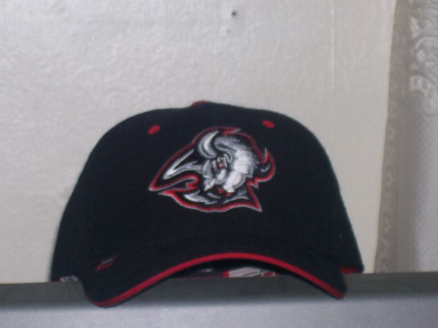
I haven't posted in quite some time, so I've decided to revamp my blog and start posting things that are at least somewhat interesting and relevant to society...So, whether you like it or not, the Sabres kick much ass. They could have easily taken the cup last season if it weren't for the disastrous injuries that piled up, and they're primed to take it this season (started the season with a 10-game winning streak, and are currently tied with Anaheim for the most points). One thing that I really just have to express is my complete hatred for the new logo. The new logo is so hated by all of western NY, in fact, that a petition with well over 30,000 signatures has been issued to Tom Golisano to change it, preferably back to the classic 70's logo (pictured left). You can read all about Buffalo's rich 30+ year history, and all 3 logos, at the wikipedia entry. Now, the new jersey looks ok, but ok isn't good enough for the Sabres. It's very clear that the fans react more positively when they come out in their 3rd (classic) jerseys. Don't get me wrong, I'm not afraid of change. I liked the previous red&black jerseys quite a bit, as well as their corresponding logo; but if you're gonna make a drastic change like this, especially going back to the classic colors, at least show some respect to your heritage. This page shows some designs by John Slabyk, born and raised in Buffalo, which are far superior to the current logo/jerseys. if you click on the section titled "previous concepts", you'll see far more ideas that he has layed down, all of them to Golisano himself, and all of them Sabre-worthy. Come on, Tom, get with the program: the Sabres pretty much are Buffalo right now (I love them, but the Bills suck it hard right now), and you can't go messing with their fan base like this; give us what we want: a GOOD LOGO.


